# Grab the libraries we want to use
import numpy as np
import pandas as pd
import matplotlib.pyplot as plt

# Clear out pesky warnings
import warnings
warnings.filterwarnings('ignore')

# Set style for better visibility
plt.style.use('ggplot')

# Set random seed for reproducibility
np.random.seed(42)Statistics for Machine Learning
Essential Concepts with Python
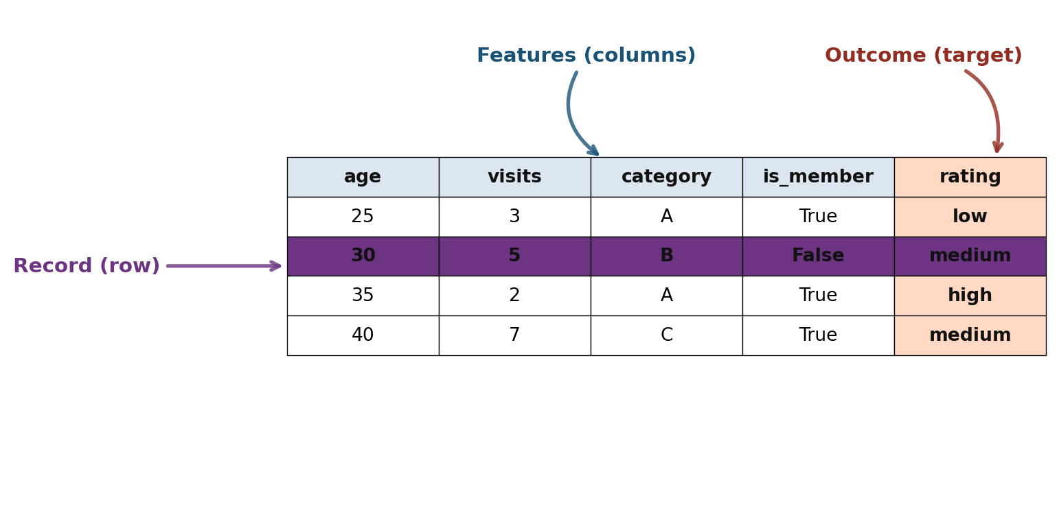
Tabular Data Structure
Key Terms
- Data Frame: Basic structure for analysis
- Feature: A column (attribute, predictor, variable)
- Record: A row (case, observation, sample)
- Outcome: Target variable to predict
Percentiles and Boxplots
np.random.seed(42)
data = np.random.exponential(scale=2, size=100)
percentiles = np.percentile(data, [5, 25, 50, 75, 95])
Percentiles (5th, 25th, 50th, 75th, 95th):
5th percentile: 0.09
25th percentile: 0.43
50th percentile: 1.25
75th percentile: 2.62
95th percentile: 5.95Show/Hide Code
fig, ax = plt.subplots(figsize=(10, 3))
bp = ax.boxplot(data, vert=False, widths=0.5)
ax.set_xlabel('Value')
ax.set_title('Boxplot of Exponential Distribution')
ax.grid(alpha=0.3)

# Add percentile markers
for p, val in zip([25, 50, 75], [percentiles[1], percentiles[2], percentiles[3]]):
    ax.axvline(val, color='red', linestyle='--', alpha=0.5, linewidth=1)

plt.tight_layout()
plt.show()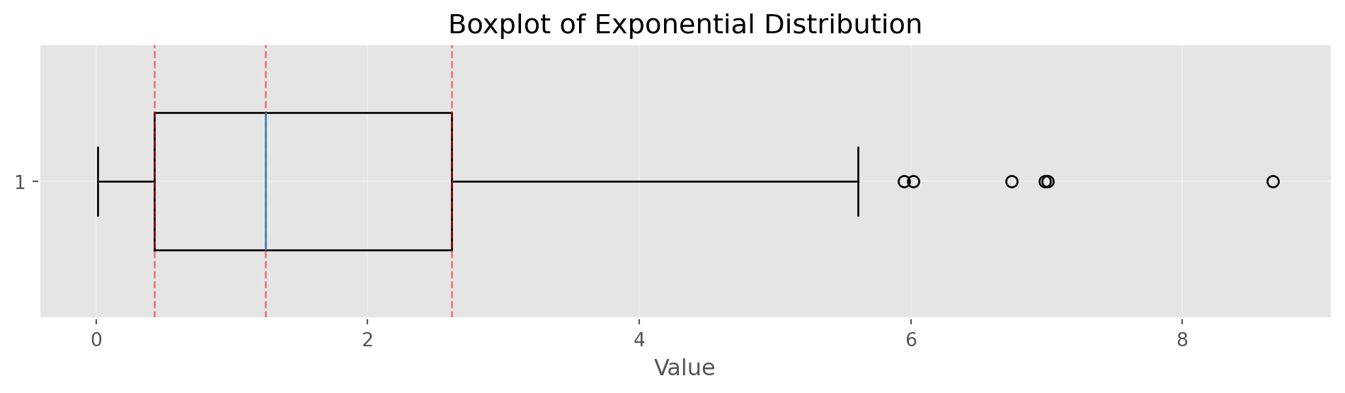
Frequency Tables and Histograms
np.random.seed(42)
data = np.random.normal(100, 15, 1000)
Show/Hide Code
fig, ax = plt.subplots(figsize=(10, 3.5))
counts, bins, patches = ax.hist(data, bins=30, edgecolor='black', alpha=0.7, color='steelblue')
ax.set_xlabel('Value')
ax.set_ylabel('Frequency')
ax.set_title('Histogram of Normal Distribution (μ=100, σ=15)')
ax.grid(alpha=0.3)
plt.tight_layout()
plt.show()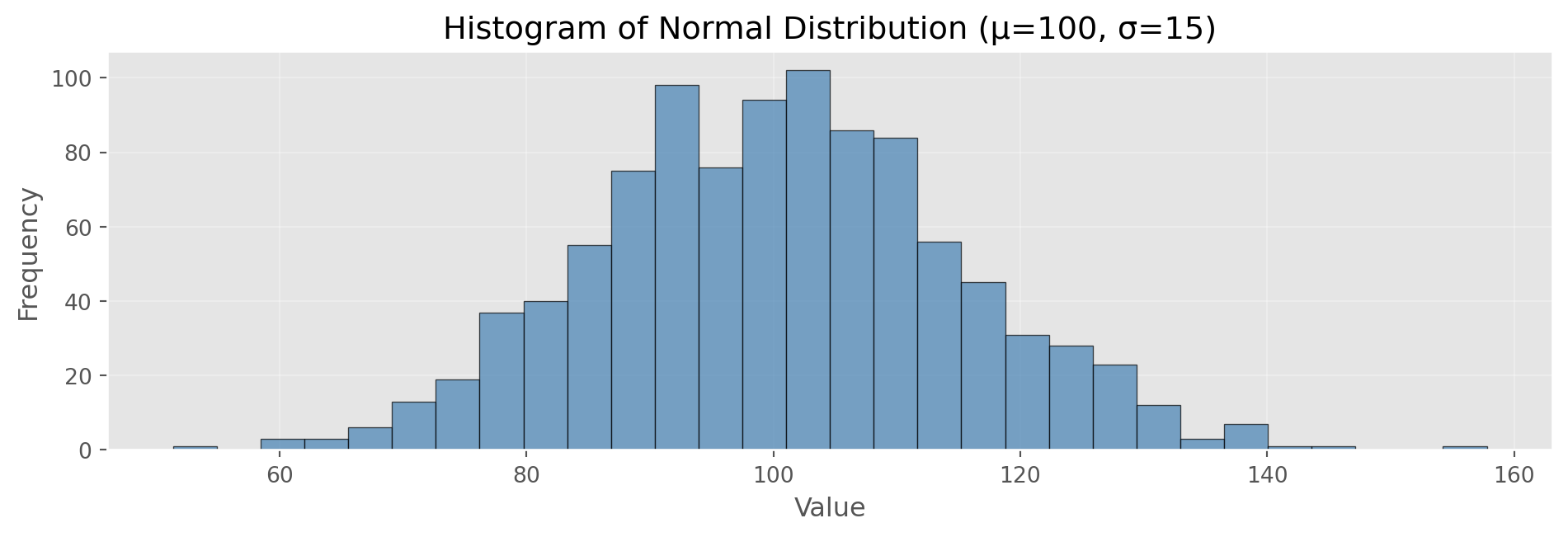
Frequency Table (first 5 bins):
  [51.4, 54.9): 1 observations
  [54.9, 58.5): 0 observations
  [58.5, 62.0): 3 observations
  [62.0, 65.6): 3 observations
  [65.6, 69.1): 6 observations

Total observations: 1000
Mean: 100.29, Std: 14.69
Density Plots
Show/Hide Code
# Kernel density estimation (simple implementation)
def kde(data, x_eval, bandwidth=0.5):
    """Simple Gaussian kernel density estimation"""
    n = len(data)
    density = np.zeros_like(x_eval, dtype=float)
    for xi in data:
        kernel = np.exp(-0.5 * ((x_eval - xi) / bandwidth) ** 2)
        kernel /= (bandwidth * np.sqrt(2 * np.pi))
        density += kernel
    return density / n

# Generate data
np.random.seed(42)
data = np.random.normal(100, 15, 1000)

# Generate density estimate
xs = np.linspace(data.min(), data.max(), 200)
density = kde(data, xs, bandwidth=3)

fig, ax = plt.subplots(figsize=(10, 3.5))
ax.hist(data, bins=30, density=True, alpha=0.5,
        edgecolor='black', label='Histogram', color='lightblue')
ax.plot(xs, density, 'r-', linewidth=2, label='Density Estimate')
ax.set_xlabel('Value')
ax.set_ylabel('Density')
ax.set_title('Density Plot: Smoothed Distribution')
ax.legend()
ax.grid(alpha=0.3)
plt.tight_layout()
plt.show()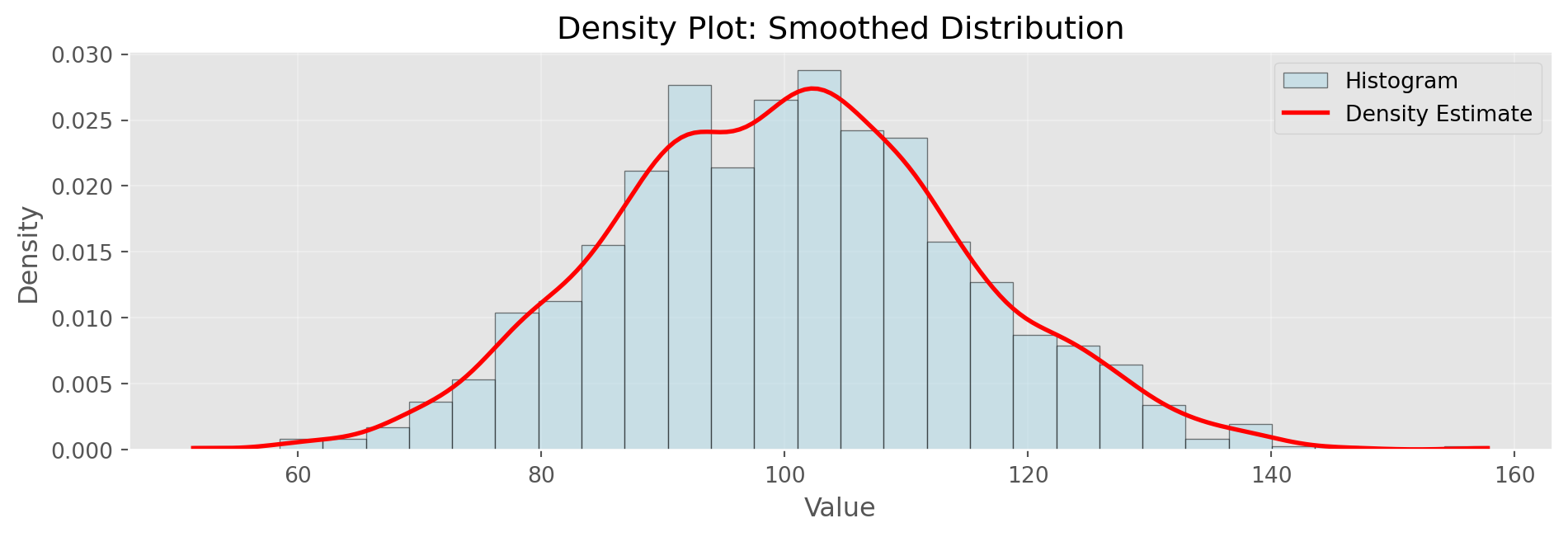
Density estimation smooths the histogram. Bandwidth parameter controls smoothness
Scatterplot with Correlation
np.random.seed(42)
x = np.random.normal(0, 1, 100)
y = 2 * x + np.random.normal(0, 0.5, 100)
correlation = np.corrcoef(x, y)[0, 1]

fig, ax = plt.subplots(figsize=(8, 3.5))
ax.scatter(x, y, alpha=0.6, s=50, color='steelblue', edgecolors='black', linewidth=0.5)
ax.set_xlabel('X', fontsize=12)
ax.set_ylabel('Y', fontsize=12)
ax.set_title(f'Scatterplot with Correlation (r = {correlation:.3f})', fontsize=14)
ax.grid(alpha=0.3)

# Add regression line
z = np.polyfit(x, y, 1)
p = np.poly1d(z)
x_line = np.linspace(x.min(), x.max(), 100)
ax.plot(x_line, p(x_line), "r-", linewidth=2, alpha=0.8, label='Best Fit Line')
ax.legend()

plt.tight_layout()
plt.show()

print(f"Slope of regression line: {z[0]:.3f}")
print(f"Intercept: {z[1]:.3f}")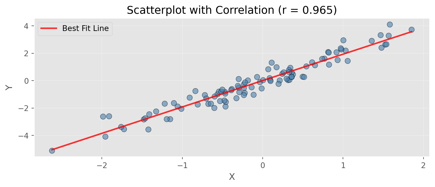
Slope of regression line: 1.928
Intercept: 0.004
Hexagonal Binning
# Large dataset example
np.random.seed(42)
n = 10000
x = np.random.normal(0, 1, n)
y = 2 * x + np.random.normal(0, 1, n)

fig, ax = plt.subplots(figsize=(10, 3.5))
hb = ax.hexbin(x, y, gridsize=30, cmap='Blues', mincnt=1, edgecolors='black', linewidths=0.2)
cb = plt.colorbar(hb, ax=ax, label='Count')
ax.set_xlabel('X')
ax.set_ylabel('Y')
ax.set_title(f'Hexagonal Binning for Large Datasets (n={n:,})')
ax.grid(alpha=0.3)
plt.tight_layout()
plt.show()

print(f"Total data points: {n:,}")
print(f"Correlation: {np.corrcoef(x, y)[0,1]:.3f}")
print(f"\nHexagonal binning aggregates dense point clouds into bins")
print(f"Useful when scatterplots become too dense to interpret")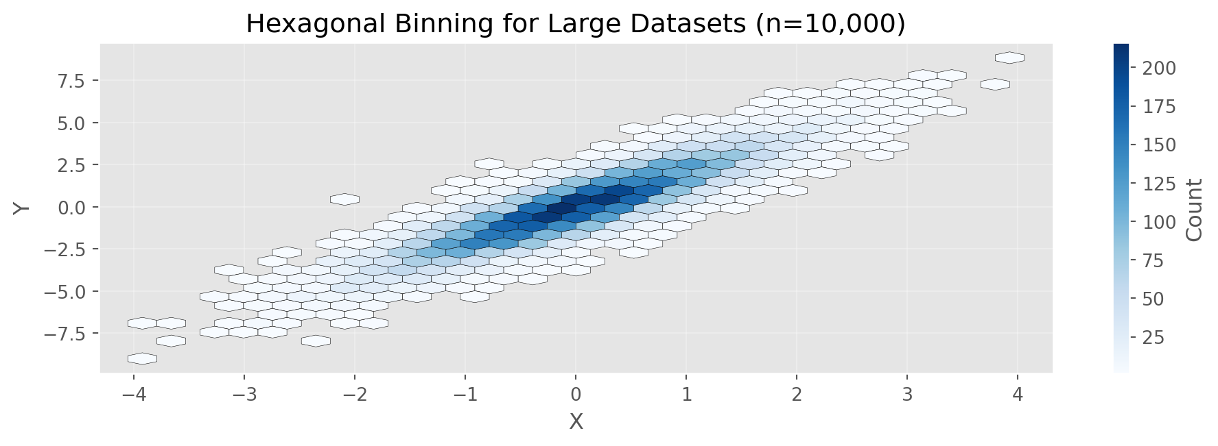
Total data points: 10,000
Correlation: 0.894

Hexagonal binning aggregates dense point clouds into bins
Useful when scatterplots become too dense to interpret
Categorical Data: Bar Charts
# Flight delay causes
causes = ['Carrier', 'ATC', 'Weather', 'Security', 'Inbound']
percentages = [23.02, 30.40, 4.03, 0.12, 42.43]

fig, ax = plt.subplots(figsize=(10, 3.5))
bars = ax.bar(causes, percentages, color='steelblue', edgecolor='black', alpha=0.8)
ax.set_ylabel('Percentage (%)', fontsize=12)
ax.set_title('Airline Delays by Cause at DFW Airport', fontsize=14)
ax.grid(axis='y', alpha=0.3)

# Add percentage labels on bars
for bar, pct in zip(bars, percentages):
    height = bar.get_height()
    ax.text(bar.get_x() + bar.get_width()/2., height,
            f'{pct:.1f}%', ha='center', va='bottom', fontsize=10)

plt.tight_layout()
plt.show()

print("Delay Causes Summary:")
for cause, pct in zip(causes, percentages):
    print(f"  {cause:12s}: {pct:5.2f}%")
print(f"\nTotal: {sum(percentages):.2f}%")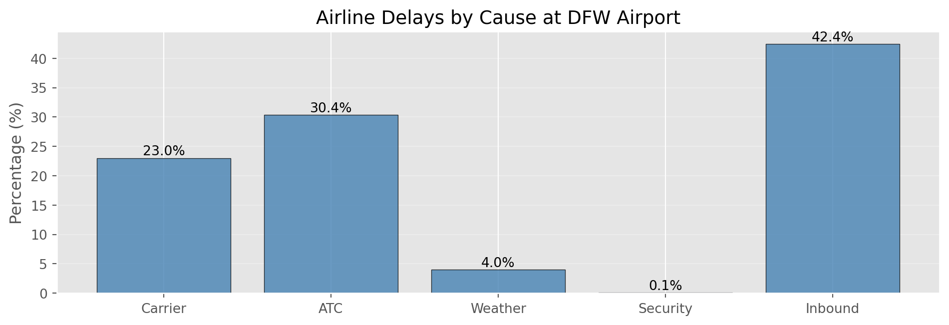
Delay Causes Summary:
  Carrier     : 23.02%
  ATC         : 30.40%
  Weather     :  4.03%
  Security    :  0.12%
  Inbound     : 42.43%

Total: 100.00%Violin Plots
# Compare distributions across groups
np.random.seed(42)
group_a = np.random.normal(10, 2, 100)
group_b = np.random.normal(12, 3, 100)
group_c = np.random.normal(11, 1.5, 100)

data_violin = [group_a, group_b, group_c]

fig, ax = plt.subplots(figsize=(10, 3.5))
parts = ax.violinplot(data_violin, positions=[1, 2, 3],
                      showmeans=True, showmedians=True)
ax.set_xticks([1, 2, 3])
ax.set_xticklabels(['Group A', 'Group B', 'Group C'])
ax.set_ylabel('Value', fontsize=12)
ax.set_title('Violin Plot: Comparing Distribution Shapes', fontsize=14)
ax.grid(alpha=0.3, axis='y')
plt.tight_layout()
plt.show()

print("Summary Statistics by Group:")
for name, data in [('A', group_a), ('B', group_b), ('C', group_c)]:
    print(f"  Group {name}: Mean={np.mean(data):.2f}, Std={np.std(data, ddof=1):.2f}")
print("\nViolin width shows density at each value level")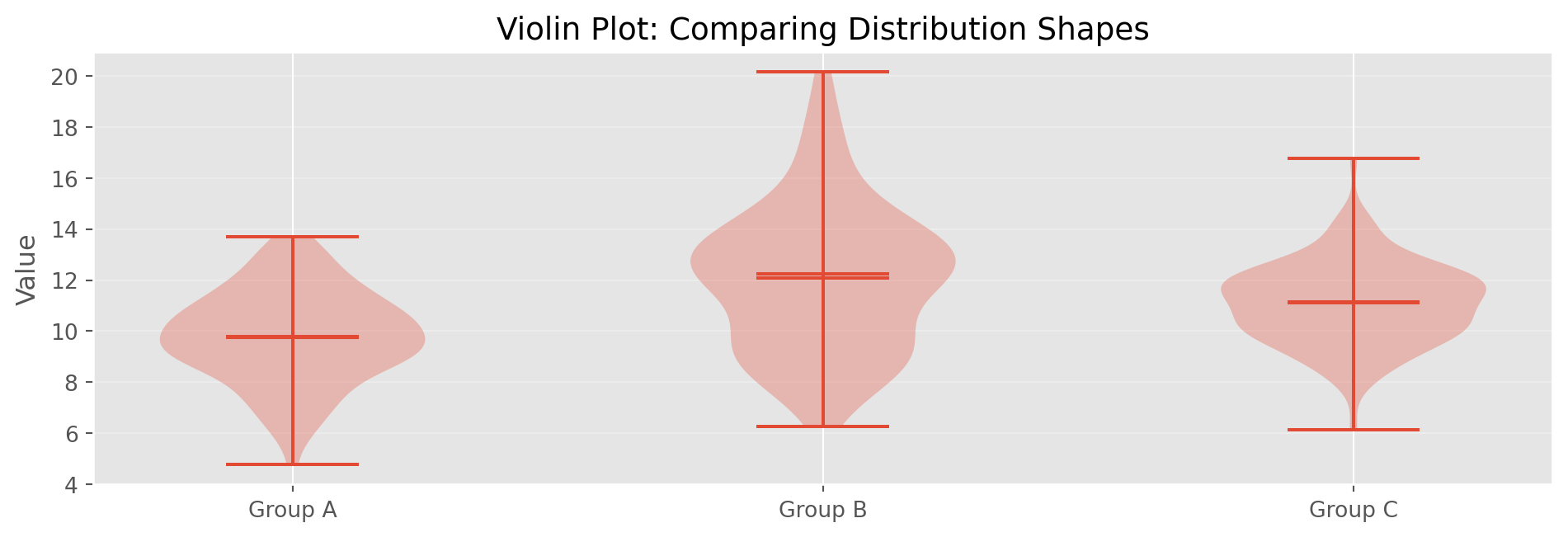
Summary Statistics by Group:
  Group A: Mean=9.79, Std=1.82
  Group B: Mean=12.07, Std=2.86
  Group C: Mean=11.10, Std=1.63

Violin width shows density at each value levelDemonstrating Sampling Distribution
# Draw many samples and compute means
np.random.seed(42)
population = np.random.exponential(scale=2, size=10000)
sample_means = [np.mean(np.random.choice(population, 30))
                for _ in range(1000)]

fig, axes = plt.subplots(1, 2, figsize=(12, 3.5))

axes[0].hist(population, bins=50, edgecolor='black', alpha=0.7, color='lightcoral')
axes[0].set_title('Population Distribution (Exponential)', fontsize=12)
axes[0].set_xlabel('Value')
axes[0].set_ylabel('Frequency')

axes[1].hist(sample_means, bins=30, edgecolor='black', alpha=0.7, color='lightblue')
axes[1].set_title('Sampling Distribution of Mean (n=30, 1000 samples)', fontsize=12)
axes[1].set_xlabel('Sample Mean')
axes[1].set_ylabel('Frequency')

plt.tight_layout()
plt.show()

print(f"Population mean: {np.mean(population):.3f}")
print(f"Mean of sample means: {np.mean(sample_means):.3f}")
print(f"Std dev of sample means: {np.std(sample_means):.3f}")
print(f"\nNote: Even though population is skewed, sampling distribution is normal!")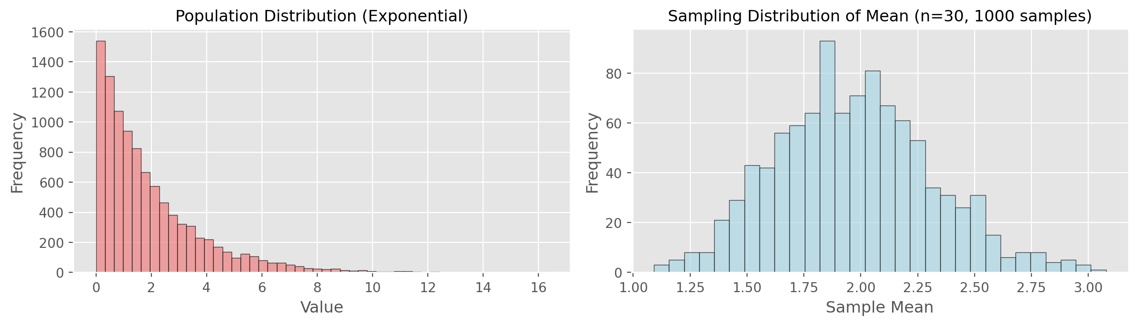
Population mean: 1.955
Mean of sample means: 1.968
Std dev of sample means: 0.343

Note: Even though population is skewed, sampling distribution is normal!Bootstrap Implementation
# Original sample
np.random.seed(42)
original_sample = np.random.normal(100, 15, 50)

# Bootstrap resampling
n_bootstrap = 1000
bootstrap_means = []

for _ in range(n_bootstrap):
    resample = np.random.choice(original_sample,
                                size=len(original_sample),
                                replace=True)  # WITH replacement!
    bootstrap_means.append(np.mean(resample))

bootstrap_means = np.array(bootstrap_means)

# Plot results
fig, ax = plt.subplots(figsize=(10, 3.5))
ax.hist(bootstrap_means, bins=30, edgecolor='black', alpha=0.7, color='lightgreen')
ax.axvline(np.mean(original_sample), color='red',
           linestyle='--', linewidth=2, label='Original Sample Mean')
ax.set_xlabel('Bootstrap Mean')
ax.set_ylabel('Frequency')
ax.set_title(f'Bootstrap Distribution ({n_bootstrap} resamples)')
ax.legend()
ax.grid(alpha=0.3)
plt.tight_layout()
plt.show()

print(f"Original Sample Mean: {np.mean(original_sample):.2f}")
print(f"Bootstrap SE: {np.std(bootstrap_means):.2f}")
print(f"Formula SE: {np.std(original_sample, ddof=1)/np.sqrt(50):.2f}")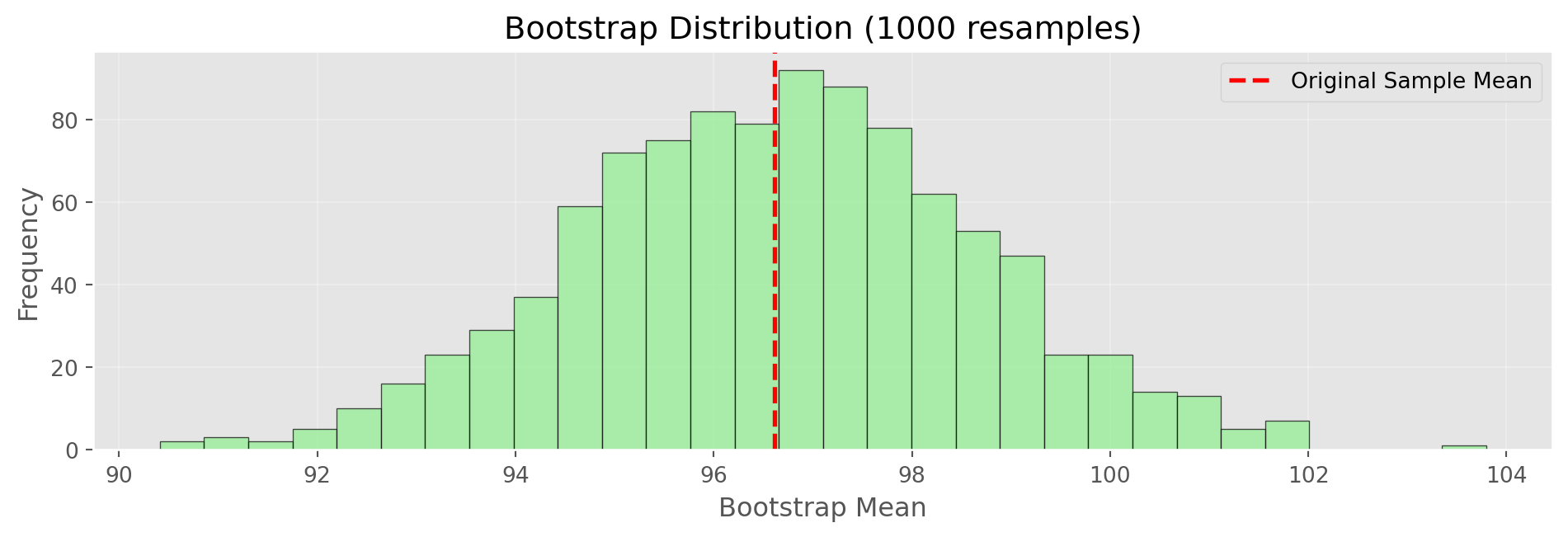
Original Sample Mean: 96.62
Bootstrap SE: 2.00
Formula SE: 1.98Normal Distribution
# Normal PDF function
def normal_pdf(x, mu=0, sigma=1):
    """Calculate normal probability density function"""
    return (1 / (sigma * np.sqrt(2 * np.pi))) * \
           np.exp(-0.5 * ((x - mu) / sigma) ** 2)

# Generate normal distribution
x = np.linspace(-4, 4, 1000)
y = normal_pdf(x, 0, 1)

fig, ax = plt.subplots(figsize=(10, 3.5))
ax.plot(x, y, 'b-', linewidth=2, label='Standard Normal')
ax.fill_between(x, y, where=(x >= -1) & (x <= 1),
                alpha=0.3, label='68% (±1 SD)', color='blue')
ax.fill_between(x, y, where=((x >= -2) & (x < -1)) | ((x > 1) & (x <= 2)),
                alpha=0.2, label='95% (±2 SD)', color='green')
ax.set_xlabel('Z-score (Standard Deviations)')
ax.set_ylabel('Density')
ax.set_title('Standard Normal Distribution')
ax.legend()
ax.grid(alpha=0.3)
plt.tight_layout()
plt.show()

print("Standard Normal Properties:")
print("  68% of data within ±1 SD")
print("  95% of data within ±2 SD")
print("  99.7% of data within ±3 SD")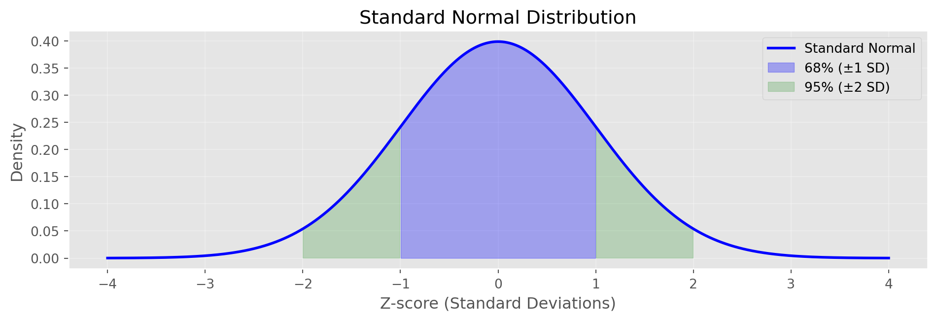
Standard Normal Properties:
  68% of data within ±1 SD
  95% of data within ±2 SD
  99.7% of data within ±3 SD
Q-Q Plots
def qq_plot(data, ax, title):
    """Create Q-Q plot manually"""
    standardized = (data - np.mean(data)) / np.std(data, ddof=1)
    standardized = np.sort(standardized)
    n = len(standardized)
    theoretical = np.array([np.percentile(np.random.standard_normal(10000),
                            100 * (i - 0.5) / n) for i in range(1, n + 1)])
    ax.scatter(theoretical, standardized, alpha=0.6, s=30)
    ax.plot([-3, 3], [-3, 3], 'r--', linewidth=2, label='Perfect Normal')
    ax.set_xlabel('Theoretical Quantiles')
    ax.set_ylabel('Sample Quantiles')
    ax.set_title(title)
    ax.grid(alpha=0.3)
    ax.legend()

np.random.seed(42)
normal_data = np.random.normal(0, 1, 100)
exp_data = np.random.exponential(1, 100)

fig, axes = plt.subplots(1, 2, figsize=(12, 3.5))
qq_plot(normal_data, axes[0], 'Q-Q Plot: Normal Data')
qq_plot(exp_data, axes[1], 'Q-Q Plot: Exponential Data')
plt.tight_layout()
plt.show()

print("Interpretation:")
print("  Left: Points on line → data is normally distributed")
print("  Right: Points deviate → data is NOT normally distributed")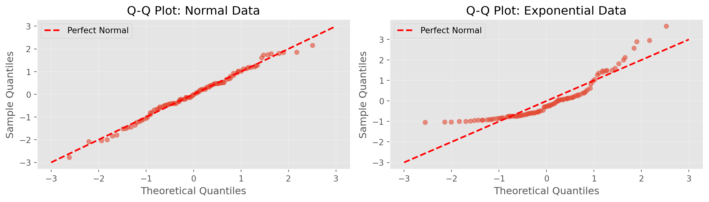
Interpretation:
  Left: Points on line → data is normally distributed
  Right: Points deviate → data is NOT normally distributed
Binomial Distribution in Python
def binomial_pmf(k, n, p):
    """Calculate binomial probability mass function"""
    def factorial(x):
        if x <= 1: return 1
        return x * factorial(x - 1)
    def comb(n, k):
        return factorial(n) // (factorial(k) * factorial(n - k))
    return comb(n, k) * (p ** k) * ((1 - p) ** (n - k))

n = 20  # trials
p = 0.3  # probability of success

x = np.arange(0, n+1)
pmf = np.array([binomial_pmf(k, n, p) for k in x])

fig, ax = plt.subplots(figsize=(10, 3.5))
ax.bar(x, pmf, edgecolor='black', alpha=0.7, color='steelblue')
ax.set_xlabel('Number of Successes')
ax.set_ylabel('Probability')
ax.set_title(f'Binomial Distribution (n={n} trials, p={p} success probability)')
ax.grid(alpha=0.3, axis='y')
plt.tight_layout()
plt.show()

prob_5 = binomial_pmf(5, n, p)
prob_le_5 = sum([binomial_pmf(k, n, p) for k in range(6)])
print(f"P(exactly 5 successes) = {prob_5:.4f}")
print(f"P(5 or fewer successes) = {prob_le_5:.4f}")
print(f"Expected value (mean) = n×p = {n*p:.1f}")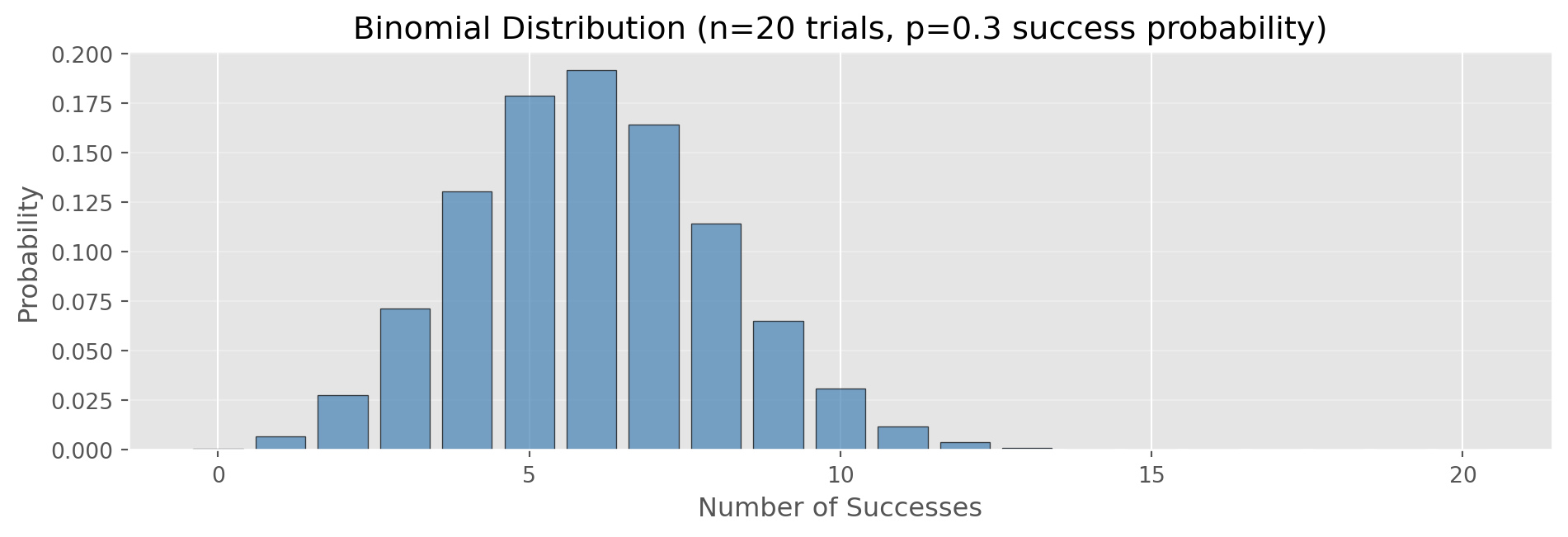
P(exactly 5 successes) = 0.1789
P(5 or fewer successes) = 0.4164
Expected value (mean) = n×p = 6.0
Poisson Distribution in Python
import math

def poisson_pmf(k, lam):
    """Calculate Poisson probability mass function"""
    return (lam ** k) * np.exp(-lam) / math.factorial(k)

lambda_rate = 3  # average events per interval

x = np.arange(0, 15)
pmf = np.array([poisson_pmf(k, lambda_rate) for k in x])

fig, ax = plt.subplots(figsize=(10, 3.5))
ax.bar(x, pmf, edgecolor='black', alpha=0.7, color='coral')
ax.set_xlabel('Number of Events')
ax.set_ylabel('Probability')
ax.set_title(f'Poisson Distribution (λ={lambda_rate} events/interval)')
ax.grid(alpha=0.3, axis='y')
plt.tight_layout()
plt.show()

# Generate random Poisson data (simulation)
np.random.seed(42)
poisson_data = np.random.poisson(lambda_rate, 100)
print(f"Theoretical mean (λ): {lambda_rate}")
print(f"Simulated mean: {np.mean(poisson_data):.2f}")
print(f"Theoretical variance (also λ): {lambda_rate}")
print(f"Simulated variance: {np.var(poisson_data, ddof=1):.2f}")
print(f"\nUse for: arrivals, calls, defects per time/space unit")
Theoretical mean (λ): 3
Simulated mean: 2.78
Theoretical variance (also λ): 3
Simulated variance: 3.14

Use for: arrivals, calls, defects per time/space unit
Exponential Distribution in Python
def exponential_pdf(x, lam):
    """Calculate exponential probability density function"""
    return lam * np.exp(-lam * x)

rate = 0.5  # events per unit time
scale = 1/rate  # mean time between events

x = np.linspace(0, 10, 1000)
pdf = exponential_pdf(x, rate)

fig, ax = plt.subplots(figsize=(10, 3.5))
ax.plot(x, pdf, 'b-', linewidth=2, label=f'rate={rate}')
ax.fill_between(x, pdf, alpha=0.3)
ax.set_xlabel('Time Between Events')
ax.set_ylabel('Density')
ax.set_title(f'Exponential Distribution (λ={rate}, mean={scale:.1f})')
ax.legend()
ax.grid(alpha=0.3)
plt.tight_layout()
plt.show()

# Generate random exponential data
np.random.seed(42)
exp_data = np.random.exponential(scale=scale, size=100)
print(f"Theoretical mean (1/λ): {scale:.2f}")
print(f"Simulated mean: {np.mean(exp_data):.2f}")
print(f"\nUse for: time between events (complement to Poisson)")
print(f"Example: time between customer arrivals")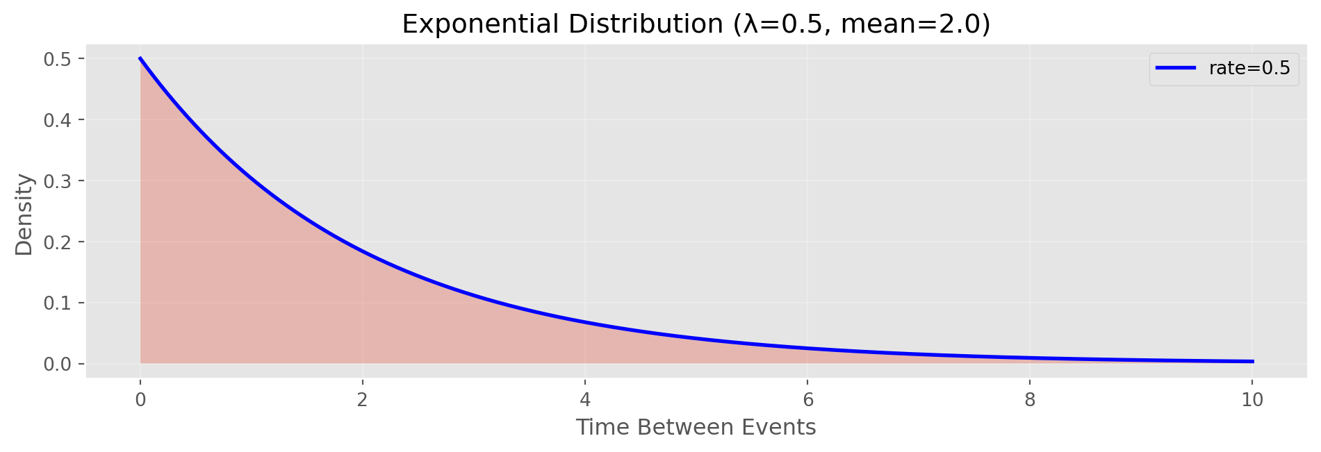
Theoretical mean (1/λ): 2.00
Simulated mean: 1.83

Use for: time between events (complement to Poisson)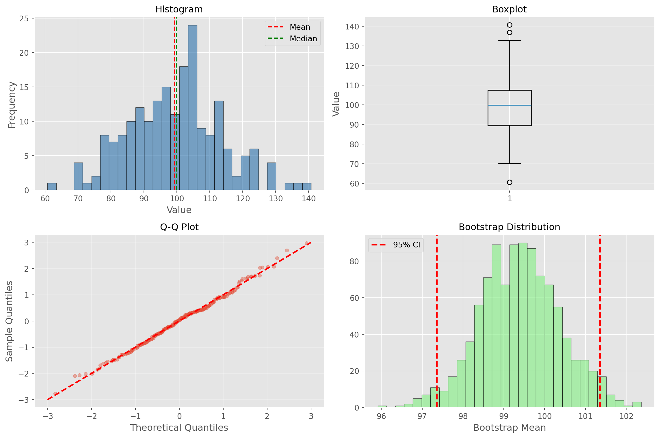
Example: time between customer arrivalsComplete Example (continued)
# 3. Comprehensive visualization
fig, axes = plt.subplots(2, 2, figsize=(12, 8))

# Histogram
axes[0, 0].hist(data, bins=30, edgecolor='black', alpha=0.7, color='steelblue')
axes[0, 0].axvline(np.mean(data), color='red', linestyle='--', label='Mean')
axes[0, 0].axvline(np.median(data), color='green', linestyle='--', label='Median')
axes[0, 0].set_title('Histogram', fontsize=12)
axes[0, 0].set_xlabel('Value')
axes[0, 0].set_ylabel('Frequency')
axes[0, 0].legend()

# Boxplot
axes[0, 1].boxplot(data, vert=True)
axes[0, 1].set_title('Boxplot', fontsize=12)
axes[0, 1].set_ylabel('Value')
axes[0, 1].grid(alpha=0.3, axis='y')

# Q-Q Plot
standardized = (data - np.mean(data)) / np.std(data, ddof=1)
standardized = np.sort(standardized)
n = len(standardized)
theoretical = np.array([np.percentile(np.random.standard_normal(10000),
                        100 * (i - 0.5) / n) for i in range(1, n + 1)])
axes[1, 0].scatter(theoretical, standardized, alpha=0.4, s=20)
axes[1, 0].plot([-3, 3], [-3, 3], 'r--', linewidth=2)
axes[1, 0].set_xlabel('Theoretical Quantiles')
axes[1, 0].set_ylabel('Sample Quantiles')
axes[1, 0].set_title('Q-Q Plot', fontsize=12)
axes[1, 0].grid(alpha=0.3)

# Bootstrap distribution
axes[1, 1].hist(boot_means, bins=30, edgecolor='black', alpha=0.7, color='lightgreen')
axes[1, 1].axvline(ci[0], color='r', linestyle='--', linewidth=2, label='95% CI')
axes[1, 1].axvline(ci[1], color='r', linestyle='--', linewidth=2)
axes[1, 1].set_title('Bootstrap Distribution', fontsize=12)
axes[1, 1].set_xlabel('Bootstrap Mean')
axes[1, 1].legend()

plt.tight_layout()
plt.show()